Wednesday, November 29, 2006

Mike Moran: Tiny Pleasures


Mike Moran wants to give hope to all of the hapless urban dwellers out there. The British ceramicist has created several clever containers that will help bring some green into even the tiniest spaces.

The Pop-off Planter (top) can be attached to just about any vertical surface with a single screw and can snap in/out of its holder for watering and replanting. And when your little plants finally bloom, you can put the tiny flowers in Moran's microvases (bottom), standing proud at 3 cm tall. Perfect for those of us living without any land to call our own.

Tuesday, November 28, 2006

Come Sail Away


Is it just me or do all things wonderful originate in Maine? Not only is Maine home to Angela Adams and North Haven Community Days, it's also the inspiration for these great bags. Made from recycled sails, these little beauties are extremely durable and can hold everything.

There are now several companies turning out recycled sail totes - they all have the same bright graphics, but the difference is in the details. Personally, I'm a fan of the Portland-based Sea Bags (left) because of the rope handles, but Reiter8 (right) is by far the most affordable option at $65.

Red Flag Design is the fanciest of the bunch (they're actually from Vancouver to give credit where credit is due). Red Flag bags (below) come in several different styles ranging from duffels to wallets and have nice detail work like woven handles and quilted patches. (Thanks to Jamien, designklub island correspondent)

Monday, November 27, 2006

Familia tableware

"Sometimes you have to start all over again." Such is the advice from the design mecca Normann Copenhagen. With the launch of their new 'Familia' tableware collection, designer Ole Jensen set out to make, "a service set like the gods would have created." The designs are based on 6,000 year old Mesopotamian traditions, stripping away all the excess details and focusing on the simplest and most elegant forms. Now available to the gods, and to you, at the Scandinavian Design Center.

Sunday, November 26, 2006

For Better or Worse: Shelving


Loyal designklub member Nate sent an email wanting some suggestions for bookshelves. While there are quite a few options out there for the bulky, typical box shapes (if that's what you want see Brave Space Design's tetris shelves), here at designklub we have a different vision. We want our design to be functional, beautiful, well-polished and fun. Every piece should make you smile or inspire you in some way.

Here are two great examples of shelves that fit the bill. At the top we have Frederik Roije's 'Storylines' shelving, which shakes up the standard flatliner we're all used to and gives it a little life. Next is the 'Tangram' series from the brilliant Italian furniture company Lago. Just like in elementary school, you can use the shapes to create geometric people, animals, letters or whatever else your inner math genius can imagine.

While both these options are good examples of creative design - they are kind of pricey and certainly don't fit within my decorating budget. November's ReadyMade had a great bookcase made from scavenged drawers, which had all the charm of the shelves above (and for under $50)! In the end, I'm a big proponent of finding a good starter piece and painting, slicing or gluing to make it your own. Hopefully these shelves just give you an idea of the wonderful possibilities.

Friday, November 24, 2006

B+N: Iconic Panels


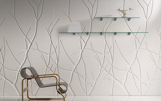
As if you didn't have enough choice for your walls - here's a few more options from B+N. Their 'Iconic' wall panels are made from laminate formed over a carved wooden core. They have 11 different surface designs along with multiple colors and finishes. Because of the materials used, the panels can be cut, glued, nailed or drilled.

Thursday, November 23, 2006

Lorem Ipsum Cuff


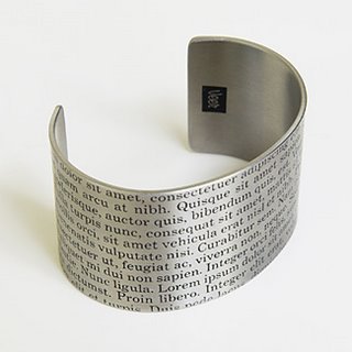
For all the graphic design addicts out there, this one is for you. The 'Lorem Ipsum' cuff by Veer ($55) is a stainless steel ode to the nonsense filler-text that has been used by typesetters and designers for centuries. It's a nice little accessory too. (Via NOTCOT)

Wednesday, November 22, 2006

Studio Job: Perished

I know that I recently did a post on Studio Job, but I absolutely love their 'Perished' collection and had to share it. Maybe its because I used to do exhibit design and spent my days painstakingly painting fossil casts that I am so drawn to these pieces, but I think their work can be universally adored. The collection includes wooden tables, benches, wardrobes and screens finished in black and inlaid with the hand cut images of animal fossils. The colors are perfect and so is Studio Job.

Tuesday, November 21, 2006

Mystic Clock

Normally I wouldn't write anything about clocks (or watches for that matter), since I don't want to encourage anyone to be so intimately bound to time. And besides, there are simply more exciting things to put on your wall. But something struck me about the 'Mystic Clock' by Matt Carr for Umbra. The face is covered with frosted glass, creating a soft, ghostly effect. I guess if you want to be constantly reminded of the time, at least this clock delivers it in a gentle manner.

Monday, November 20, 2006

Safety First


Rebecca Turbow's 'Safe Clothes' are what design should be about. Turbow came up with the concept for her mod, space-age clothing line while still in school and has followed her fancy with a passion ever since. She designs clothes that will protect the wearer both physically and emotionally from the outside world with circles covering vital organs and the use of durable, extra soft fabrics.

Her early focus on turquoise and white has evolved to include more muted tones in the Fall 2006 collection (along with the addition of some great coats), but the rules of safety and strong geometric forms have remained the same. Here's hoping the future will bring more from our Great Protector - I for one would like a Safe Sofa and maybe a necklace or two.

Sunday, November 19, 2006

Helen Amy Murray

I first heard about Helen Amy Murray through 100% Design press, but was recently reminded of her genius on design*sponge. One of her recent commissions, a 1950's dentist chair, is a good example of her work. You might think those roses are added elements, but they are amazingly part of the fabric surface. Murray has created a new technique in the textile world, which is no small feat. Her secret approach involves some serious quilting and slicing skills, and the end result is a sculptural surface unlike anything you've ever seen.
Saturday, November 18, 2006

David Trubridge: Coral Light

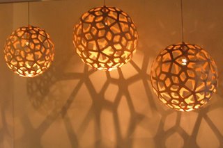
David Trubridge's Coral Light is a refreshing reminder that the simplest design can offer the most satisfying results. The lamp is actually constructed of 60 individual plywood pieces which fasten together with little rivets. I love how the skeletal structure fills the room with beautiful shadows too. The Coral Light, as well as the designer's other wooden creations, can be found at greenergrassdesign.com.

Friday, November 17, 2006

Eva Solo Flowerpot

For anyone who regularly forgets to water their houseplants, Eva Solo has come to the rescue. My plants have actually adapted to the neglect, but for any untrained foliage this new flowerpot is great. It has a little reservoir at the bottom which the plant can draw water from whenever needed. When the cup is empty - refill! Its so easy I almost feel bad for not improving the situation for my own potted friends. The flowerpot comes in four different ceramic colors and is available through Sprout Home.

Wednesday, November 15, 2006

A Cup a...


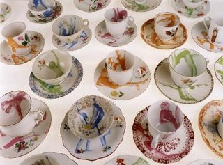
Dutch artist Esther Derkx is adding some spice to tea time. Her 'Improved Crockery' seems a bit more sophisticated to me than some of the other dishware designers out there. Esther screenprints pictures of dancers and athletes onto scavenged cups, saucers and teapots. The result is like a step back in time. The ghostly added images combined each piece's delicate original pattern almost makes me feel like I'm looking at pictures of the dish's original owner from yesteryear.

Tuesday, November 14, 2006

Take Out: Klaus Aalto

Klaus Aalto knows what its like to be invited to a last minute craft session. His 'Take Out' drawer and briefcase system is perfect for staying organized at home, while being ready to take your show on the road. The briefcase drawers are made out of plastic, so you can store anything from tools to art supplies without worry. I'm not crazy about the white color, but I do love a new take on the art of stylish storage.

Monday, November 13, 2006

Fly-Pitcher Shelves

While I've never been able to make a respectable paper airplane myself, I still love any sort of aerial inspired design. At this year's Salone Satellite, the design group Fly-Pitcher exhibited their whimsical shelves - which are made out of carbon fiber. The designers, who are self-professed "science junkies", definitely hit the mark with this project and their wonderful combination of nerd meets design.

Sunday, November 12, 2006

Binth for Your Walls


I just discovered that Binth has started selling one of a kind screen prints using some of their wonderful designs. Each little work of art (5.5" x 5.5") comes matted and ready go.

Saturday, November 11, 2006

Urban Gnomes

This one is for my friend Jen who holds a special place in her heart just for garden gnomes. Well here is an updated version by the London design group, Vitamin. Their 'Urban Gnomes' are made out of bone china and can be used indoors or out. Not all the designs are as scary as this one, but with a face like this, it will be the number one gnome on the block. (Via Charles & Marie)

Friday, November 10, 2006

Loving Luisa


While working for an Italian textile company, Luisa Cevese noticed the amount of waste that went into production and it gave her an idea. After teaming up with a plastics company she went to work giving the fabric scraps new life. She now encases the remnants in resin and uses them to create durable and unique totes, coin purses, ipod cases - and the list goes on.

Recently she has also started taking old linens - including lace pieces and stained tablecloths - to make rugs and wall hangings using the same process. Her bags are available through the MoMa store.

Thursday, November 09, 2006

Karen Ryan

Karen Ryan exhibited her "Custom Made" chair collection at this year's 100% Design in London and was an instant hit with her wonderfully strange creations. Using pieces of unwanted furniture, Karen blends together different styles, colors and materials to create beautiful new chairs that are each a unique piece of art.

She also showed her "Second Hand" plate collection, which reminds me of Sarah Cihat, but with a twist. After rescuing the plates from thrift stores, Karen removes part of the pattern, leaving behind traces of the original image as well as an emotive message. (Via Inhabit)


Tuesday, November 07, 2006

Paper Part 4: Wallcoverings

While Tracy Kendall's wall coverings are not new to the design scene, her innovative approach is certainly worth a mention. Tracy is a master of detail and many of her designs include hand-sewn additions such as buttons and sequins. Another line called "In the White Room," (above) uses individually cut and stitched pieces of paper to create a fluttering, 3-dimensional effect.

I wanted to include a profile on French paper artist Pierre Pozzi as well, but I have not been able to find any photos of his work. I have sent an email to him so hopefully we'll get some info soon! If you get a chance take a look at his kraft paper installation which was shown in the Nov./Dec. Vogue Living Australia.

Sunday, November 05, 2006

Paper Part 3: Vittorio Passaro


OK, this is one very closely related to paper, although the final result is ceramic. Artist Vittorio Passaro creates these beautiful vessels by folding, twisting and sculpting paper that is coated with gypsum until he reaches his desired form. By taking a negative mold of these shapes, he can create ceramics which capture the delicate nature of the original paper structures.

This collection, called 'Filmpaper Ceramics' was on exhibit this year at the Salone Satellite show in Milan. Unfortunately, I have not been able to find a website or any contact info for Vittorio, but I'll continue to search. Please send me an email if you have more information. Thanks.

Saturday, November 04, 2006

Paper Part 2: Studio Job


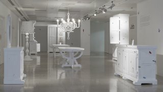
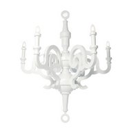
Remember when paper-mache meant lumpy casts of your friend's hand and misshapen pinatas? Well Studio Job has elevated the art to an entirely new level with their 'Paper Collection' for Moooi. The Dutch designers have crafted a whole line of furniture - including tables, cabinets and an impressive chandelier, out of the most humble ingredients - paper, cardboard and paper-mache. Makes me wish I hadn't given up on the medium after elementary school.

Paper Part 1: Ana Hagopian


Paper is used for notecards and drawing, but it can be much more exciting when it becomes vases, jewelry and wallcoverings. For the next few days I am going to post on some wonderful paper projects I have been noticing.

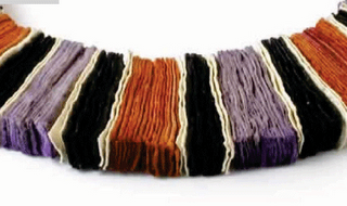
The first paper spotlight is on Ana Hagopian. Ana is a Barcelona-based artist who makes exquisite jewelry from paper and other recycled/recyclable materials. Her colorful pieces look delicate close-up, but when you take in the complete picture they turn into robust, eye-catching works.

Friday, November 03, 2006

Friday Shuffle

I am frantically working to catch up on my NanoWriMo project (day three and I'm already behind) so no new posts today. If you are looking for a good read though, check out Lena Corwin's site - it's great. What I like about Lena's blog is that it is filled with inspirations and projects, rather than just finished products. Enjoy.

http://lenacorwin.blogspot.com/

Thursday, November 02, 2006

FM DIY

This I like. The Tune N' Radio by wouter Geense Design Studio is your basic, everyday FM radio -except that the user has to finish it in order for it to work. What you get is the no-frills box and then you select and attach the objects that will become the tuner, volume control and antennae. In addition, you have to drill holes in the front for the sound. The idea behind it is that if a person has some input into the design of their belongings, he/she will become more attached to them and less likely to just toss them away.

Wednesday, November 01, 2006

I. Ronni Kappos


I. Ronni Kappos makes beautiful jewelry from the simple combination of glass, silk and silver. To make her unique designs, she uses a secret stash of vintage glass beads she got from a long-lost German glassworks factory. The pigments used in the creation of the beads are no longer available, giving the glass its unusual color and making each piece a one of a kind treasure. Available at Greener Grass Design.

As a side note, I just found out you can find designklub by doing a google search, which I am way more excited about than is sensible.